Page 1 of 1
8th it
Posted: Wed Jan 03, 2007 1:09 am
by Subsist
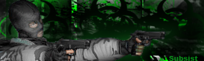
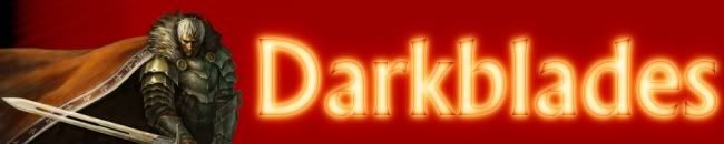
Ive got a request from somewhere else for a banner for this site...
http://darkblades.editboard.com/
and this is the banner how is it?
Posted: Wed Jan 03, 2007 4:37 am
by 8th
eh..its kinda plain. Im dont like that font to much, but i guess it could work. And im not sure about the whole glowing font look. i would say give it another shot.
Posted: Wed Jan 03, 2007 5:56 am
by Subsist
He did want it a bit plain and plus i guess opinions change from a gamers prospective they like fire and stuff you know all that magic shit.
Posted: Wed Jan 03, 2007 9:28 am
by 8th
yeah, its better than the one they have now, thats for sure. I dont know, maybe try some different shit for the BG or somethin to make it a little less plain. or maybe ad the dark area you have on the left, to the right as well.
and change your post font color damnit.
Posted: Wed Jan 03, 2007 10:45 am
by Haz
7/10
It Was Pretty Str8
Posted: Wed Jan 03, 2007 1:42 pm
by TwIzTiD
6/10 Background could use something more.
Posted: Wed Jan 03, 2007 5:08 pm
by drunken jesus
nerds'll like it its got a video game character on it
Posted: Wed Jan 03, 2007 9:00 pm
by Subsist
yeaah all killah understands the point here. its actually made FOR nerds thus the video chracter.
Posted: Fri Jan 05, 2007 7:04 am
by complexity
everyone is saying its good, the background could just be a little better, anyway its way better then their current one
Posted: Sat Jan 06, 2007 3:34 am
by Subsist
Ok cool thanks for the feedback.
Now rate this...starting to mess around with lightning.